Less coding, more designing: Update #3
This week I did something different. As much as I love vibe coding my way through things these past few months, I wanted to slow down and work on layouts and redesigns instead.
At first I thought I'd fall into another rabbit hole, tweaking and "perfecting" designs until I lost the whole week to it. So I kept the scope tight.
I needed a few signature elements that tie back to my personal branding. I wanted the design to match the content and the type of site it's on, so there's better resonance with whoever's reading.
I needed a clean dashboard UI and landing page for my quiet branch, the one that sources data, analytics, and applied intelligence. And I wanted the layouts to be timeless. I don't want to be rethinking this stuff every other week. That's how you trap yourself.
Focusing on the overhaul this week instead of writing more code was liberating. It also did something I didn't expect: it forced me to understand more clearly what each project or blog is supposed to be long-term.
Here's what I designed or redesigned.
Personal Blog (pieterborremans.com)
This was the toughest one, because I had to migrate the entire blog off WordPress first. That still feels like a bad breakup. But it's done.
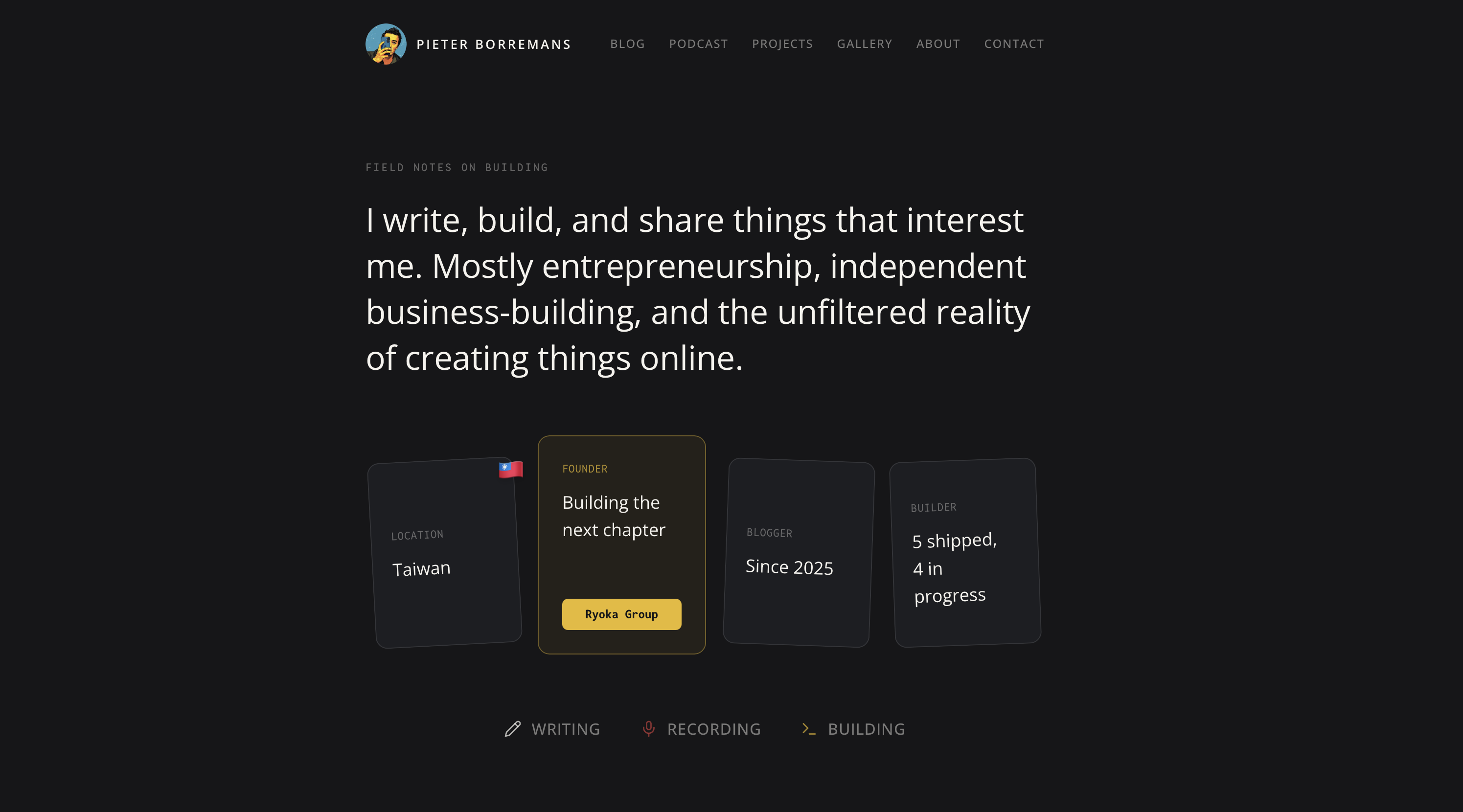
I wanted the homepage to be minimal and narrow, but still tell you instantly what this is all about. The four cards in the hero section give you an immediate read on what, how, and where, and the three keywords underneath, each linked to its own page or section, tell you what I do.
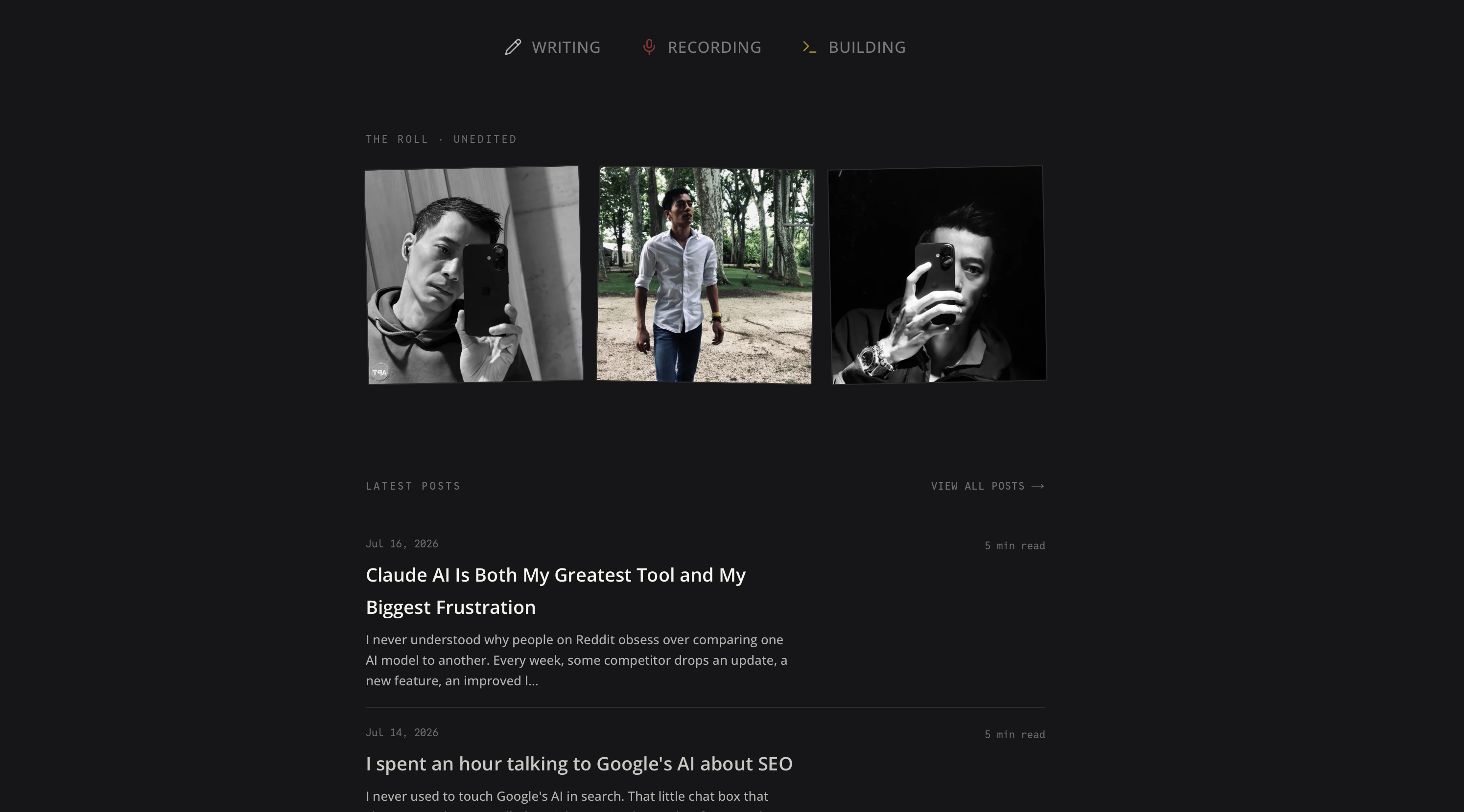
To make it more personal, I added three profile photos tied to a gallery. That gallery works as a moodboard, but it's also a kind of proof: no AI-generated photos floating around here. Only the real ones make it into the gallery.
My Life in Taiwan (pieter.tw)
This one's fairly new. I wanted a clear split between my personal journal and my life as a foreigner living in Taiwan. Splitting it out makes the blog more niche and more useful, especially for other foreigners who are planning to move here or already live here.
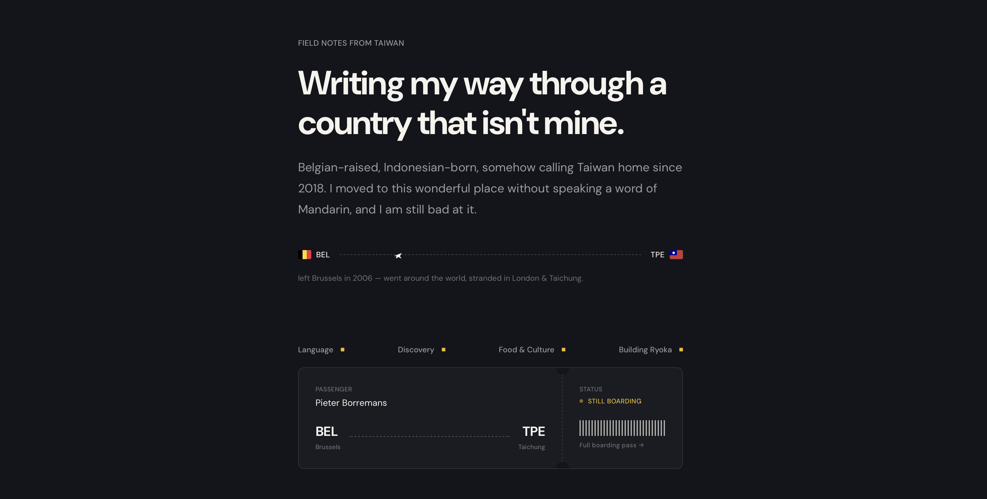
I wanted the design itself to carry my identity, roots, and where I am today. The flight and boarding pass elements, the BEL to TPE routing, are meant to signal right away that this blog is about travel and about life as a foreigner here.
I carried that boarding pass element across other pages and into the blog feed itself.
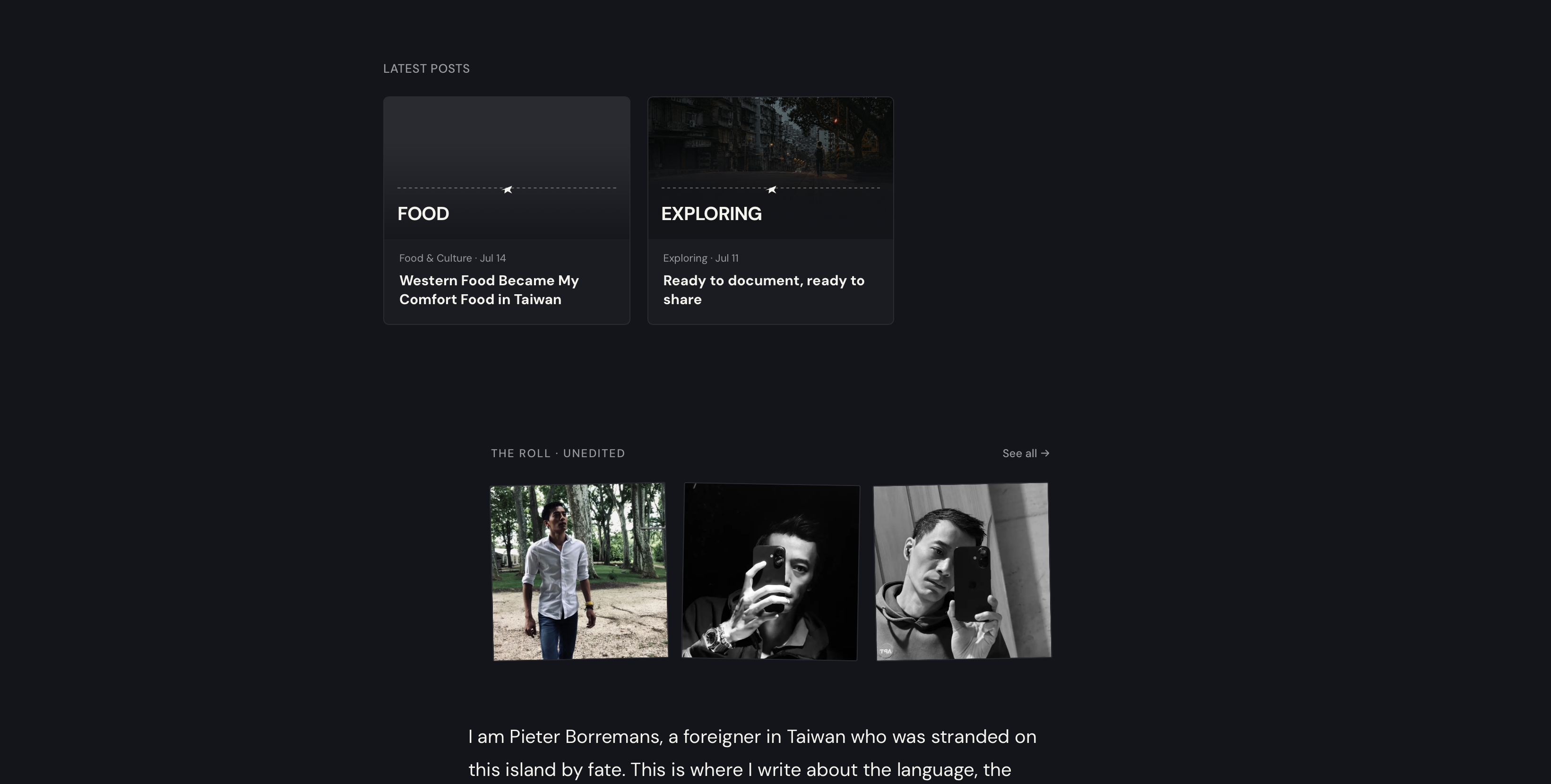
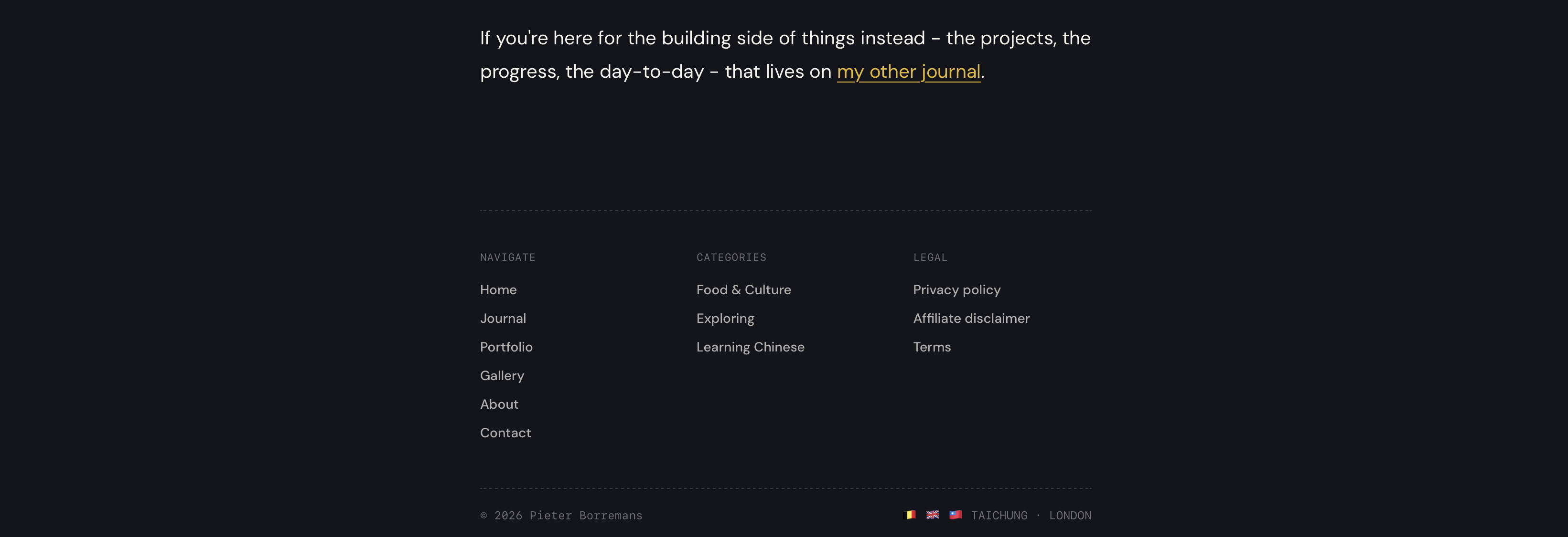
I reused the same gallery and photo style from the main blog, which makes it obvious both sites belong to the same person. Same goes for the footer: same style, same three flags, Belgium, UK, and Taiwan, which ties the two together.
Indie Hacker Blog (indiehacker.blog)
I put more thought into this overhaul than the old layout ever got, mostly because it's going to be a real part of the media and publishing network I'm building to fuel Ryoka Group's ambitions.
After a lot of back and forth, I landed on keywords like roadmap, wireframe, timeline, shipping, and solo founders, and built the design around them.
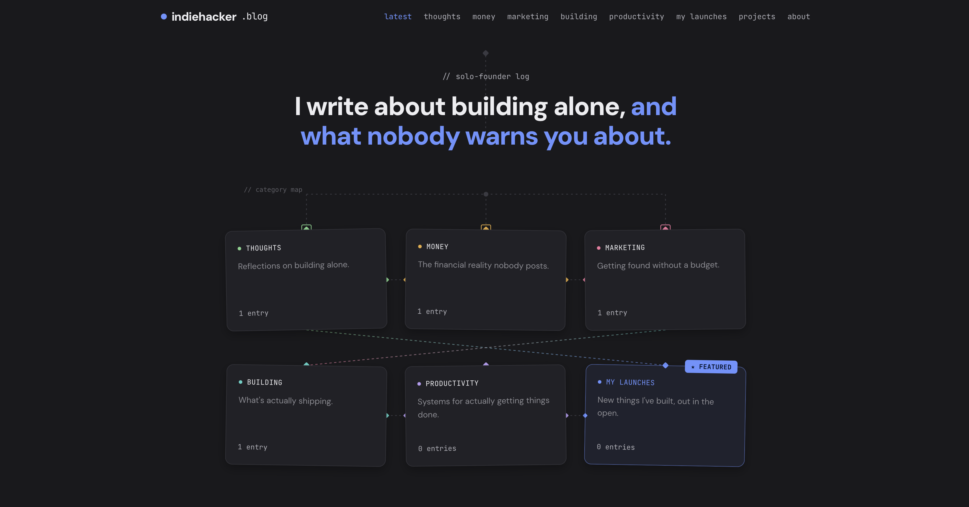
The result is something I genuinely enjoy looking at. It doesn't scream WordPress template or free theme anymore. It says custom, thoughtful, and it resonates with founders.
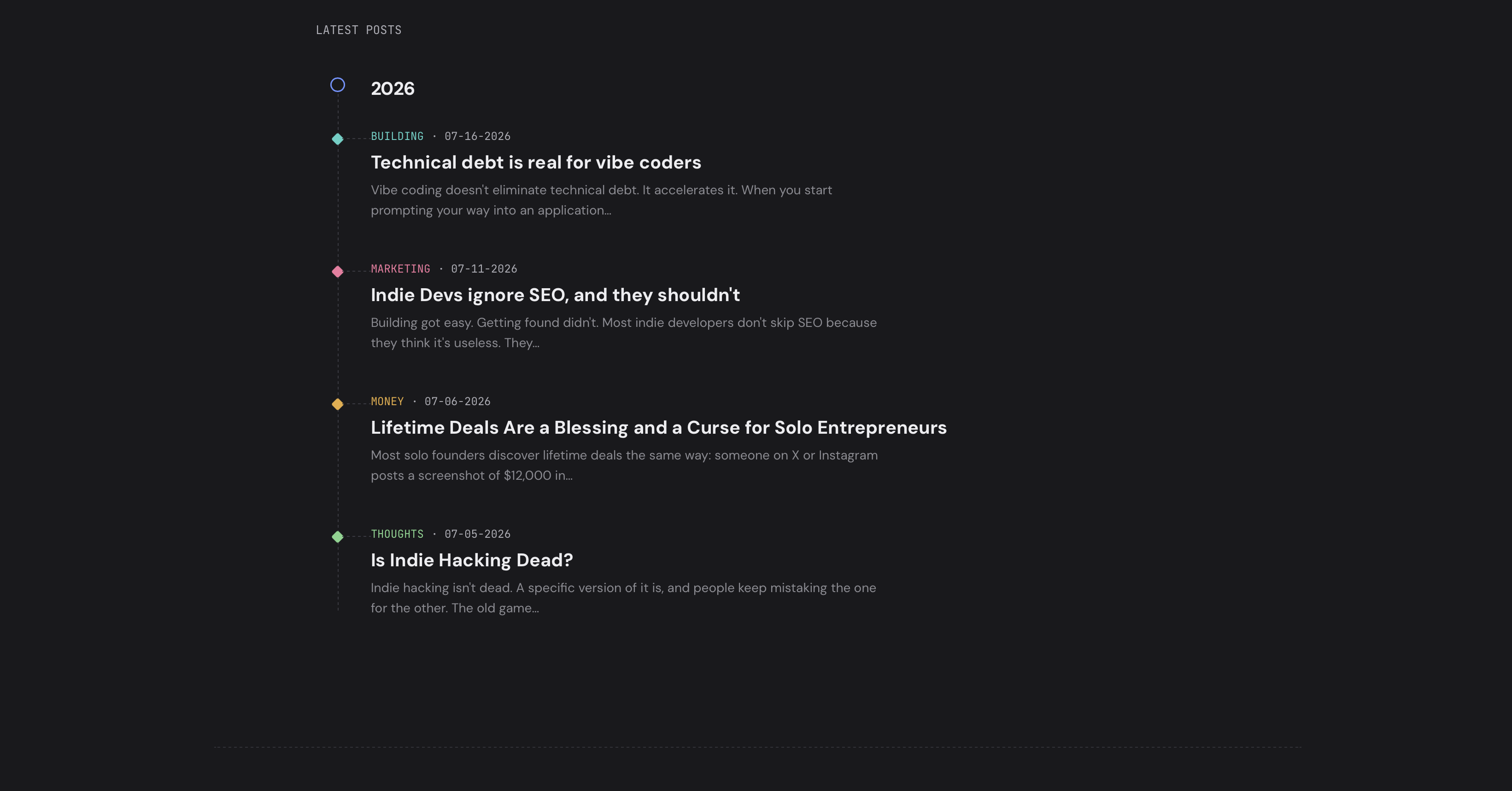
I carried that same thinking into the blog feed, which reinforces what the blog is actually about. And I extended my footer signature with the three flags again, to keep it complete.
One Peak Two (onepeaktwo.com)
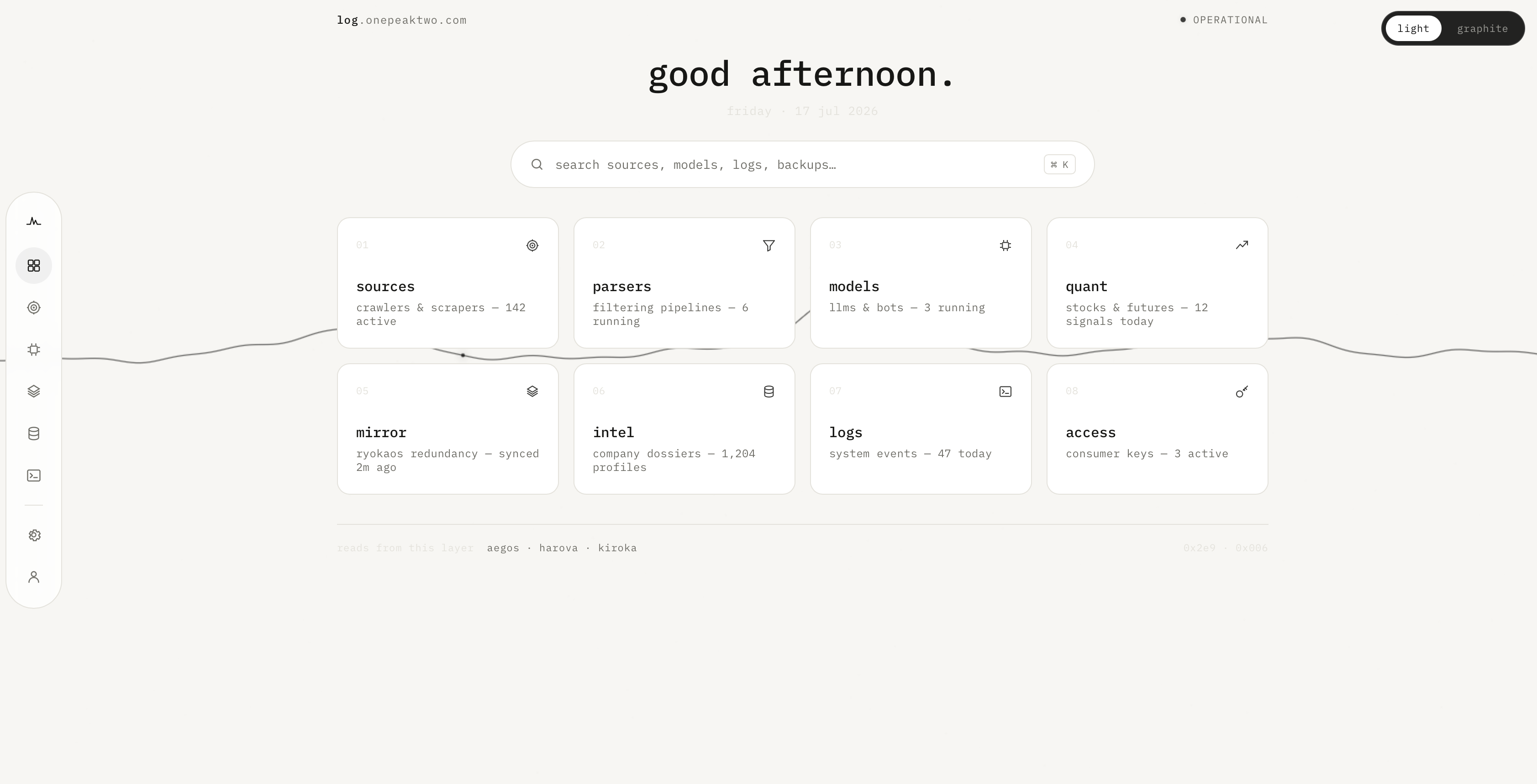
This one isn't commercial. It runs quietly in the background. But I still wanted to design something that felt intentional rather than thrown together.
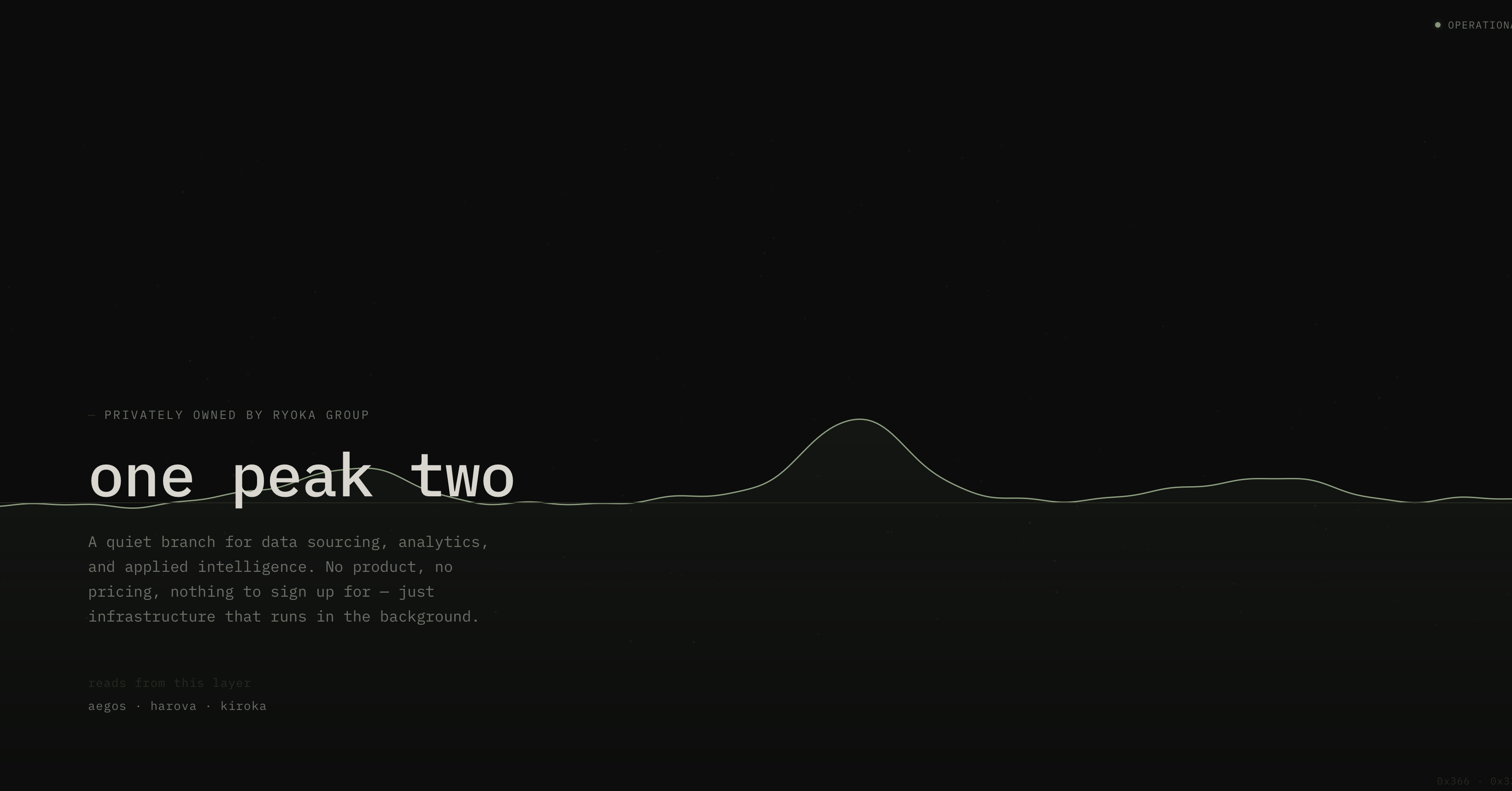
The landing page matches the custom dashboard I'm building for it (has light and dark mode), though this branch deserves its own post at some point to explain what OPT is. The layout of the dashboard is still a bit of a work in progress, but you get the idea.
Final Word
I'm happy with where the design work landed this week, and with the decision to make everything more recognizable as mine.
None of this would have been possible if I were still running these blogs on WordPress. Vercel and Next.js let me see how much room there is to build something custom, something that doesn't look like AI slop or another template pulled off a shelf.
That's the whole point. When the design is mine, built from scratch, it stops feeling like a container I'm renting and starts feeling like something I own.
Get new posts before anyone else
No noise, no automation sequences. Just what I'm writing, thinking about, and building, sent when there's something worth sending.
An email once in a while. Unsubscribe anytime.
Written by
Pieter Borremans
Writer·Content creator·Founder
Based in Taichung, Taiwan and London, UK, this is Pieter's personal journal and builder's blog: field notes on entrepreneurship, solo business-building, and the unfiltered reality of creating online. Alongside it, he's chasing one absurd goal in public, $168M USD in lifetime earnings, tracked live from zero.